
Responsive Web Design (RWD): Crafting User-Centric Digital Experiences
In the digital age, where information is at our fingertips, having a dynamic online presence is essential. But the diversity of devices, screen sizes, and resolutions that users employ to access the internet poses a significant challenge for web designers and developers. Enter Responsive Web Design (RWD), a paradigm shift that prioritizes user experience across all platforms. In this comprehensive guide, we’ll delve into the world of RWD, its principles, benefits, and best practices for creating adaptable and user-centric web experiences.
 Understanding Responsive Web Design
Responsive Web Design is an approach to web design and development that aims to make web pages render well on a variety of devices and window or screen sizes. It is characterized by the following key principles:
- Fluid Grid Layouts: Instead of fixed pixel-based layouts, RWD employs fluid grid systems that adapt to the available screen space. This ensures that content remains visually appealing and readable across devices.
- Flexible Images: RWD employs CSS techniques to ensure that images and media also adapt to different screen sizes without losing quality or breaking the layout.
- Media Queries: Media queries are CSS rules that allow designers to apply different styles based on the characteristics of the device or screen. This includes factors like screen width, height, and orientation.
- Progressive Enhancement: RWD embraces the philosophy of progressive enhancement, starting with a baseline design that works on all devices and then adding advanced features and styles for larger screens or capabilities.
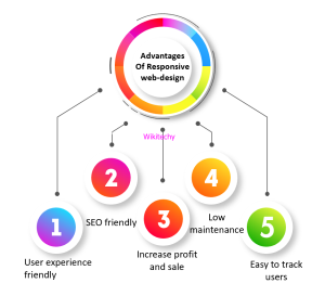 Benefits of Responsive Web Design
- Enhanced User Experience: RWD ensures that users can access and interact with your website seamlessly, regardless of the device they are using. This leads to higher user satisfaction and longer engagement.
- Improved SEO: Responsive websites often perform better in search engine rankings. Google, for example, prioritizes mobile-friendly sites in its search results.
- Cost-Efficiency: Maintaining a single responsive website is more cost-effective than managing separate desktop and mobile versions. It reduces development and maintenance overhead.
- Broader Audience Reach: With RWD, you can reach a wider audience, including users on smartphones, tablets, laptops, and desktop computers, without having to create specific versions for each device.
- Future-Proofing: As new devices with varying screen sizes and resolutions emerge, RWD ensures that your website remains adaptable and future-proof.
Best Practices for Responsive Web Design
- Mobile-First Approach: Start by designing for mobile devices, focusing on the core content and functionality. Then progressively enhance the design for larger screens.
- Fluid Grids: Use relative units like percentages rather than fixed pixel values for layout elements to allow them to scale smoothly.
- Flexible Images: Implement responsive images using techniques like CSS resizing or the HTML
srcsetattribute to serve appropriately sized images based on the user’s device. - Media Queries: Write well-crafted media queries to target specific breakpoints where design adjustments are necessary.
- Testing: Regularly test your responsive design across various devices, browsers, and screen sizes to ensure consistent performance.
- Performance Optimization: Optimize your website for speed and performance. Minimize HTTP requests, leverage browser caching, and optimize images to ensure fast loading times.
- User-Centric Design: Prioritize user experience and usability in your responsive design. Ensure that navigation is intuitive, and touch interactions are smooth.
- Content Prioritization: Consider content hierarchy and prioritize essential information for smaller screens. Utilize collapsible menus or content stacking as needed.
The Evolution of Responsive Web Design
RWD has come a long way since its inception. The rise of mobile devices and the diversity of screen sizes have led to continuous innovation and refinement in responsive design practices. Here are some notable trends and developments:
- Mobile-First Indexing: Search engines like Google now predominantly use the mobile version of a website’s content for indexing and ranking. This emphasizes the importance of mobile-friendly design.
- Progressive Web Apps (PWAs): PWAs combine the best of web and mobile apps, providing an enhanced user experience. RWD is often a key component of PWAs.
- Flexbox and CSS Grid: Modern CSS layout techniques like Flexbox and CSS Grid have made it easier to create complex and responsive layouts with less code.
- Responsive Typography: RWD now includes responsive typography, allowing text to adapt to various screen sizes and resolutions for optimal readability.
- Performance-First Approach: With the emphasis on mobile devices, performance optimization has become a core aspect of responsive web design to ensure fast loading times.
Challenges and Future Trends
While RWD has revolutionized web design, it’s not without its challenges. Here are some common hurdles and emerging trends:
- Performance Optimization: As websites become more complex, ensuring optimal performance on mobile devices remains a challenge. Techniques like lazy loading and efficient resource management are critical.
- Web Accessibility: Ensuring web accessibility for users with disabilities on different devices is gaining importance. Designing with accessibility in mind is a growing trend.
- Dark Mode Support: With the increasing popularity of dark mode on devices and operating systems, supporting this feature in responsive designs is becoming essential.
- Variable Fonts: Variable fonts enable more adaptable and responsive typography options, enhancing design possibilities.
- AI-Driven Design: Artificial intelligence is being used to automate responsive design adjustments based on user behavior and preferences.
Conclusion
Responsive Web Design is more than just a design trend; it’s a fundamental approach to creating web experiences that cater to the diverse landscape of devices and user preferences. Embracing RWD not only improves user satisfaction and accessibility but also future-proofs your web presence in an ever-evolving digital world. By following best practices, staying updated with emerging trends, and prioritizing user-centric design, you can harness the full potential of Responsive Web Design to create compelling and adaptable online experiences that leave a lasting impression.